2,431 search results
(0.009 seconds)
- Prospect Park JNL by Jeff Levine,
$29.00 Prospect Park JNL was inspired by inline lettering found on some vintage sheet music from the Art Deco era entitled "By My Side". The font's namesake is located in the Crown Heights section of Brooklyn, NY. Prospect Park is famous for its zoo as well as its tree lined paths, historic carousel and the expansive park area.
 - Olpal by Bunny Dojo,
$16.00 A Display Serif, a Monoweight Sans, and an Inline form combining the two, Olpal is a versatile companion for your next adventure. With surprising vitality for a workhorse font, Olpal embraces any job – and whistles while it works. Neutral – with a hint of pizzazz – the font's strong legibility and compressed footprint make it a brilliant fit in any environment.
 - Asbury Park JNL by Jeff Levine,
$29.00 In the 1930s the WPA (Works Progress Administration) sponsored a Federal art project. Many posters were produced that featured government-sponsored cultural events, health and safety tips and various other topics. One such poster from Pennsylvania has the words “Work with Care” in a hand-lettered inline sans design. This became the basis for Asbury Park JNL.
 - Querida by Autographis,
$39.50 Querida is an elaborate, elegant, constructed script with intertwining swashes and a timeless appearance. It will serve you well for all kind of high class package design challenges.
 - Subikto One by Subtitude,
$22.00 Subikto One is the first of a series of pictograms from Subtitude foundry. We've create a multitude of hand positions and combinations. Each hand express a unique gesture.
 - Duffle Bag JNL by Jeff Levine,
$29.00Duffle Bag JNL continues Jeff Levine's series of stencil fonts. Most are from authentic, vintage sources; this one is an original... and with a sports theme to boot! - TB Valentine by TrueBlue,
$14.00This is a series of elegant ormnaments created for Valentine's day. Each ornament is designed with care to ensure that it can be used at the largest sizes. - HWT Etta by Hamilton Wood Type Collection,
$24.95 HWT Etta is a fun display typeface that has two styles: East and West! Its two variations ensure you have maximum wood type swagger in every display size that you might want. This fresh design takes a cue from the wild design experimentation that was happening in the heyday of mid 19th Century wood type—but filtered through 1960s photo-type sensibilities and served up for today’s design needs. Etta West is a decorative inline style and the Etta East is a whimsical reverse contrast style. They live together harmoniously, with their own specific flavors. Practically speaking, both styles are intended for display use, so use them big and use them proudly! Set your XXL size titles in West and your L to XL size types in East. As different as they might look at first, both fonts share a common DNA—Don’t be shy about using them together. The HWT Etta font is part of the Hamilton Wood Type and Printing Museum’s Type Legacy Project. In keeping with the project, Etta is named after Etta Shove Hamilton, who was J.E. Hamilton’s wife and the company’s first bookkeeper.
 - Safrole - Unknown license

- Miele - Unknown license

- Sacrifice - Unknown license

- Passeul - Unknown license

- SidNNancy - Unknown license

- Saltire - Unknown license

- Saccule - Unknown license

- Floydian - Unknown license

- Fragment Pro by (v) design,
$49.00 Fragment Pro is a part of a larger OpenType font family (see also Fragment Pro Inline). It is an elegant, soft and decorative typeface built on classical proportions. Its outlines have been carefuly crafted with a high attention to detail, so it could be used even at very large sizes. Fragment Pro is derived from the separately sold layered Fragment Pro Inline, however it has been significantly optimized for standalone use. Fragment has been conceived to be used as a display typeface in publications, titles, logotypes etc., but it is surprisingly legible even in smaller print sizes. Thanks to its strictly onefold oulines, Fragment can be also used as a stencil typeface. Fragment supports many OpenType features and offers great multilingual support for most of the Latin-based languages. Feel free to download the detailed PDF Specimen.
 - Escrow RE by Font Bureau,
$40.00 The Wall Street Journal commissioned the original version of Escrow. Cyrus Highsmith designed forty-four styles in this new Scotch series, which sets the tone of the front page of the Journal, envy of the newspaper industry. This version of the family is part of the Reading Edge series of fonts specifically designed for small text onscreen, having been adjusted to provide more generous proportions and roomier spacing, and having been hinted in TrueType for optimal rendering in low resolution environments.
 - Eckhardt Display Serif JNL by Jeff Levine,
$29.00The pages of a vintage sign painter's manual yields many interesting typefaces that reflect on the design styles of years gone by. Eckhardt Display Serif JNL is a distinctive, hand-lettered serif face that has a hint of Art Noveau. Part of a series of sign painter's fonts named in honor of the late Albert Eckhardt, Jr. who owned Allied Signs in Miami, Florida, Jeff Levine continues this series of fonts in tribute to his friend and the art of sign lettering. - AL Cinderella - Unknown license

- Frames 1 by Intellecta Design,
$34.90Frames 1 consists of a series of frames scanned at a low resolution. The result when magnified is a bitmapped image that looks like a black and white mosaic. - Obscure Stencil JNL by Jeff Levine,
$29.00 A bold, handmade stencil alphabet from the book “Lettering” by Harry B. Wright (1950) served as the model for Obscure Stencil JNL – available in both regular and oblique versions.
 - JOPPATOWNE - Unknown license

- Planks - Unknown license

- Monthly Meeting JNL by Jeff Levine,
$29.00 A set of plastic pin-back letters served as the model for Monthly Meeting JNL. Pin-back letters were primarily used on cork bulletin boards for changeable notices and announcements.
 - Cooper BT by Bitstream,
$34.99 Cooper Black, commissioned by Barnhart Brothers & Spindler, is the best known of Oswald Cooper’s typefaces. Bitstream has expanded the 1921 original into a complete series of round-edged text faces.
 - Glyphyx NF by Nick's Fonts,
$-This series of free fonts features symbols and icons for use in information graphics. Glyphyx One includes symbols related to transportation, while Glyphyx Two includes symbols related to leisure activities. - La Carte by AVP,
$19.00 Inspired by a series of handwritten menus produced in 1980, La Carte is a stylish but legible script that sets as well in body copy as it does in headlines.
 - DF Tapa by Dutchfonts,
$39.00 DF Tapa is a typeface based on the vernacular, popular graphics used in Spain. They proudly announce the daily fresh snacks which are homemade and served in every proper bar.
 - Pentathlon Pro by DBSV,
$80.00 Strait passages second part… I tried in this fifth (that's why she took the name "Pentathlon Pro”) consecutive font family to give her a character style with again a strait way of writing. Walking on the same considerations as the previous series (Khamai, Aeolus, Corset & Artios) I tried to give some sense of diversity for the strait passages of character: those fourteen style are the result. And in this family, the “Bold” with "Inlier" and “Bold Italic” with "Inlier Italic” engage in the same way as did the “Layered font families” in the previous series. Also I added a design statement for the twelve zodiac signs, only presented in the Bold, Inlier, Bold Italic and Inlier Italic style. This series is composed of fourteen styles with 628 glyphs each, with true italics and supports Latin, Greek and Cyrillic.
 - adidas sport - Unknown license

- Donnie - Unknown license

- Runner - Unknown license

- Generic by More Etc,
$15.00 The Generic Typeface Collection is a series of sans-serif typefaces inspired by the craftsmanship of graphic design, typesetting, and printing in the analogue era – before Adobe, Macintosh computers and desktop publishing – when dinosaurs ruled the earth. With the use of various typesetting apparatuses or dry transfer type, photo copiers, and shooting layouts and paste-ups to film, the printed results was not as exact, precise and predictable as it is today. When examining old prints, it is difficult not to like the way that characters in over- or underexposed film have a special type of vibe to them that is often sadly lost in today’s pursuit of total perfection. Encouraged by this, I saw a need for a collection of typefaces that are non-clinical and non-conformist, and some that are coarse, rough and distorted – errors that might come from poor exposure when put on film, enlargements from small point texts, or maybe quality loss from successive generations of photocopies. Or all of the above. This is an attempt to incorporate spirit and personality into a set of typefaces without losing distinction. You might call it a homage to non-perfection. I call it human. The Generic Typeface Collection consists of 11 fonts divided into four series. The three standard series – the Formal Release series, the Coarse Copy series, and the Rough Display series – all contain three fonts each. The Extra Splendor series contains a couple of shadow fonts for that little extra sparkle. Formal Release – Handcrafted & Clean The Formal Release series features sans-serif typefaces for everyday use. They are handcrafted and clean, human and uncomplicated. The Formal Release series contains three typefaces that add tons of personality to any text. G10 FR ‘Slim’ – a slightly under-exposed and clean typeface in a regular weight (228 glyphs - 1 alternate) G20 FR ‘Classic’ – a properly exposed clean typeface in a bold weight (228 glyphs - 1 alternate) G30 FR ‘Bulky’ – a heavily over-exposed clean typeface in an ultra weight (228 glyphs - 1 alternate) Coarse Copy – Dirty & Rough The Coarse Copy series features non-conformist typefaces that are worn and rough, maybe after going through that bad copier a few times too much. The Coarse Copy series contains three sans-serif typefaces that add tons of spirit to any text without compromising too much on legibility. Try them on in poster-sizes and everyone will know that you mean business. G40 CC ‘Slender’ – an under-exposed coarse typeface in a regular weight (228 glyphs - 1 alternate) G50 CC ‘Typic’ – a properly exposed coarse typeface in a bold weight (228 glyphs - 1 alternate) G60 CC ‘Huge’ – a heavily over-exposed coarse typeface in an ultra weight (228 glyphs - 1 alternate) Rough Display – Faded & Decorative The Rough Display series features attention-seeking decorative typefaces in three feature-packed fonts. Faded and gritty like the image distortion and degradation from successive generations of photocopies, they are eye-catching typefaces intended to stand out in bigger point sizes. Use these typefaces for signage, headlines and similar situations were a strong typographic statement is desired. We have packed no less than 1,334 alternate characters and 212 discretionary ligatures into this series for a greater chance of not having characters that look exactly the same more than once. G70 RD ‘Slinky’ – an under-exposed rough and decorative typeface in a regular weight (741 glyphs – 448 alternates – 66 discretionary ligatures) G80 RD ‘Standard’ – a properly-exposed rough and decorative typeface in a bold weight (748 glyphs – 448 alternates – 73 discretionary ligatures) G90 RD ‘Swollen’ – a heavily over-exposed rough and decorative typeface in an ultra weight (748 glyphs – 448 alternates – 73 discretionary ligatures) Extra Splendor – Sparkling & Extraordinary The Extra Splendor series features two shadow typefaces for that little extra sparkle. One clean shadow to be used with G20 FR ‘Classic’, and one rough shadow to be used with G80 RD ‘Standard’. Having the shadows separate from the main typeface adds another layer of expressiveness in that you can try out color combinations for that extra splendor. Tips for matching (applies to both the base font and the shadow font): Set the kerning to Metric, not optical. Increase tracking to accommodate for the shadows extra width. G25 ES ‘Classic Shadow’ – a clean shadow to be used with G20 FR ‘Classic’ (228 glyphs – 1 alternate) G85 ES ‘Standard Shadow’ – a rough shadow to be used with 80 RD ‘Standard’ (227 glyphs) OpenType features – alternate characters and discretionary ligatures – can be accessed by using OpenType friendly professional design applications, such as Adobe Illustrator, Adobe InDesign, and Adobe Photoshop.
 - Flourishes A by Wiescher Design,
$39.50 FlorishesA are a set of flourishes, that serves well for frames and other elegant embellishments, they are beginning of last century American. Your I-found-them-somewhere type-designer, Gert Wiescher
 - Parallel by Typedepot,
$19.00 Parallel is unique quite thin and pretty "expressive" typeface, designed in order to serve the fashion industry. It also works pretty well as a typeface for print, headlines and identity issues.
 - Bold Display Sans JNL by Jeff Levine,
$29.00 Bold Display Sans JNL is loosely based on one of the classic alphabets found within a Speedball Lettering Textbook of the 1940s; itself called "Bold Display". The original featured a stippled texture and inline curves placed in random patterns throughout the letters. This more simplified, all-caps version is for titling requirements where a strong, yet casual design is needed.
 - Hello Hungry by Allouse Studio,
$16.00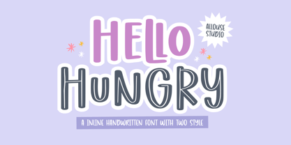 Proudly Presenting, Hello Hungry A Inline Handwritten Font With Two Styles. Hello Hungry is perfect for any titles, logo, product packaging, branding project, megazine, social media, wedding, or just used to express words above the background. Hello Hungry also come with Multi-Lingual Support. Enjoy the font, feel free to comment or feedback, send me PM or email. Thank You!
 - Sugarloaf by Hanoded,
$15.00 A sugarloaf was a conical lump in which refined sugar was sold until the late 19th century. In Fryslân you can buy sûkerbôle - a yeasty white bread containing large chunks of sugar. I must have been dreaming about the latter when I named this font! Sugarloaf is a versatile, happy, handmade display font. It comes in an inline and a black style.
 - Varvara by TeGeType,
$19.00 Varvara is a new display typefaces family create as a tribute to the work of Barbara Stepanova (1894-1958). Varvara family has light, medium and bold weights in 6 differents versions (normal, rough, screen, inline, shadow and star), all with alternates letters. All versions are provided in latin, cyrillic and greek alphabets. It can be use for text as for titling applications.


